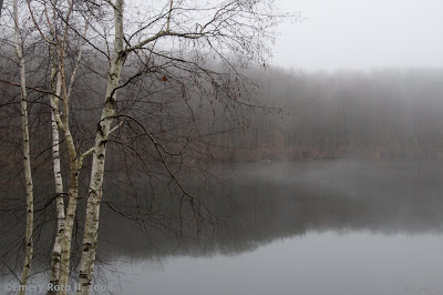
PHOTOGRAPHER'S DIARY: Yesterday I received a note asking, "How would you like your pictures to be viewed?" At first it seemed a funny question, and I wasn't at all sure what my correspondent meant. As it turns out, he'd spent considerable time with several of my images and was asking about taming his monitor to see them better. He was really asking what software I used. His question is well-timed since this image won't look like much against normal bright clutter of most computer screens. Since the question of proper viewing is so important here, I thought I'd share the suggestions I offered him.
Alas, he's Windows and I'm now firmly Mac, so if anyone has any WIN suggestions or additional tips, send them to me, and I'll pass them along. These suggestions are not for the photographers in the group, who probably have solved much of this, but for general viewers. Easiest and most important suggestions are offered first:
1. Check the lighting around your screen. Often it is a compromise designed for the various things you do around your computer. Desk lights and nearby windows sometimes glare and distract. Pull down the shade. This fix is free.
2. Some image viewers permit resizing photos to fit the screen. A photos composition can rarely be digested in pieces, and any good photo has good reasons why it begins and ends where it does. More on these viewers in a moment.
3. Do anything you can to clear away screen clutter. Most people don't realize how distracting all those scroll bars and menus are until they find software that lets them view an image against a solid background, preferably, I think, a dark one. Macintosh includes "Preview" "iPhoto," and "Mail," all of which accomplish both #1 and #2 in the various contexts in which one works with images. "Mail" is especially nice in letting one view any emailed image full screen.
4. Although it's essential to see images whole, some photos reward zooming in. The jpg images sent have limited zoomability, but you'll often find surprises you missed before you zoomed. Did you notice the abundant water drops on these birches? Zoom in and they are an important part of the image that you would have enjoyed in a good print.
5. There is a standard for monitor color. Calibration to that standard is the toughest issue to solve. Doing it properly requires expensive hardware and a bit of know-how. I use a Huey (WIN and Mac available) which not only calibrates my monitor but resets but resets it every time room lighting changes. Most importantly it gives me images where true whites and grays have no tint. Most won't want to spend for Huey. However, there are some web sites that offer free tools. Spyder, another maker of calibration hardware has some free virtual tools at their web site that will let you see how far off you are and tell you how to make some no cost fixes. (Another calibration site)


2 comments:
Not much help with calibration stuff. But I really wanted to comment on the photo. I love the composition and tones. I'm also a sucker for fog and birches. Beautiful photo.
Have a great Thanksgiving.
Diana- It's terrific to hear from you again. Glad you like this one. Yes, fog is a favorite of mine as well.
Post a Comment