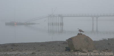
PHOTOGRAPHER'S DIARY: In response to yesterday's post Artie wondered if fog photos were harder to take than other photos. Those who read this regularly, know that I have a special love of fog images. My immediate response to the question was that fog pictures similar to yesterday's and today's were, at least technically, comparatively easy to take because the dynamic range from black to white was fairly compressed and could be encompassed easily within the limits of digital and film technologies. Of course that same limited dynamic range makes them harder to process and very hard to print well. Then I got to thinking...
I've always thought exposure for such pictures was not critical. Neal Parent advised slightly under exposing in the fog, and that may be right for shooting film. As it turns out, I made two exposures of yesterday's 44mm image, both at ISO 800. I'm not sure why I chose 800, perhaps it was windy, or perhaps I just forgot to turn it back after a previous shot. In any case, the two identical shots were two thirds of a stop apart, both f22, the first at 1/20th sec and the second at 1/30th sec. I made the finished image from the second, darker, of the two exposures because it was closer to the tones I imagined for the finished picture, because the first was almost glaringly bright, and because only the darker one had the headlights which I knew I didn't want to lose. ...and yet Artie has gotten me thinking...
I've read two distinct theories of shooting. Most experts simply advise getting the exposure right, by which they mean so the finished exposure is as close to the original as possible, at least for the critical areas of the shot; middle gray in the subject should be middle gray in the image. This is what I usually aim for. Another school of thought suggests bumping the exposure to the max, exposing as brightly as possible so long as no portion of the image exceeds the ability of the medium to record it, and adjust it back down later in Photoshop.
(Yesterday's TODAY'S)
Tonight I reprocessed both RAW exposures of yesterday's TODAY'S so as to maximize the dynamic range of each image. Spreading out of the black-to-white spectrum (the dynamic range) should make differences easy to see. What I found, surprised me. The darker image, though not taxing the range of the media, had less visual information. It was grainier and very slightly less detailed. The difference was especially noticeable along the left side of the image where the dock almost disappears into gray. Members could be recovered in the brighter image that were lost in the darker. In the darker areas on the extreme right, the darker image clotted up more, dock members were less fully formed.
But revealing detail was not my goal for the image. Indeed, I shoot in fog to lose detail. Though in this case it was true that I had worried: Would I have enough? It did seem to be a bit more crispness would not be to the detriment of the image, if not necessarily to its gain. However, color, not detail is what is critical to the success of yesterday's image. The color of the two boats must catch the eye and lead to the discovery of soft yellow and red in some of the lobster traps. If your monitor is well calibrated you will even be able to distinguish the slight green of the trees, the reddish tone of the sand and the blue of the water. The image is most beautiful to me when this is visible, even as the image approaches monochrome.
To test the validity of pushing the exposure as high as possible, I tried to process the lighter image to the darker tones I had chosen for the finished image. To my surprise, I learned this took much more reduction of contrast than I expected. In the process I noticed that the reducing contrast was taking a bit of bluish sheen from the water that was quite contrary to the flat, fog-bound image I saw in the harbor and wanted recorded in my picture. The brighter shot, brighter than the actual scene, exaggerated tonal range and in so doing upset color balances. Reducing contrast reduces detail both of edges and of gradients. By the time they looked alike, the unwanted sheen was off the water, but most of the advantage of the brighter image had been sacrificed. Only a few details showed definition missing in the chosen version. It was not enough to risk throwing out color balances especially in an image hard to process and very hard to print.
On the other hand, had I wanted a different finished effect, I had the ability to reveal detail missing in the darker version. My conclusion is bump the exposure up as a backup, but expose to the mark for safety.
Well, I've said precious little about today's image. Perhaps you can tell me what the gull is thinking about the scene in front of him.


